
| ||
Tue 2026-06-16
Mon 2026-06-15
Sun 2026-06-14
Queer Fascism and the End of Gay History Sat 2026-06-13
Fri 2026-06-12
Thu 2026-06-11
Wed 2026-06-10
Mon 2026-06-08
Search
Archives
2024
12 11 10 09 08 07 06 05 04 03 02 01
2023
2022
2021
2020
2019
2018
2017
2016
2015
2014
2013
2012
2011
2010
2009
2008
2007
2006
2005
2004
2003
One good site
MDN
Nelson Minar
Blog licensed under a Creative Commons License
|
The elections are over and the visualizations of the vote have come out. The red/blue maps, the warpy cartogram maps, the pointillist map, and the eye searing purple map. All well intentioned, many with awful colors. 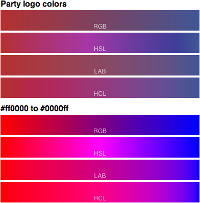 Above are eight options for red / blue color scales. The top 4 interpolate between the sedate party logo colors (from NYTimes), the bottom are fully saturated red to blue. Each set of 4 bars represents four different interpolation functions: the simplistic RGB and HSV scales and the perceptual LAB and HCL scales. Which is best? It depends on your goal. But RGB and HSL interpolation are almost always wrong, they’re very misleading. And for everyone’s eyeball safety, please don’t use fully saturated colors. |
|
