
| ||
Tue 2026-06-16
Mon 2026-06-15
Sun 2026-06-14
Queer Fascism and the End of Gay History Sat 2026-06-13
Fri 2026-06-12
Thu 2026-06-11
Wed 2026-06-10
Mon 2026-06-08
Search
Archives
2024
12 11 10 09 08 07 06 05 04 03 02 01
2023
2022
2021
2020
2019
2018
2017
2016
2015
2014
2013
2012
2011
2010
2009
2008
2007
2006
2005
2004
2003
One good site
MDN
Nelson Minar
Blog licensed under a Creative Commons License
|
One of the fun things about learning to fly is figuring out where you're going to fly. The official old-school way to plot a course is to grab a sectional chart and unfold it on a big table (or in a small cockpit), then bust out the compass, protractor, and slide rule. It's fun to do things that way, but fortunately in the modern computer age there's easier ways. (I like
AOPA's flight planner).
Google Earth is a great tool for answering the question of where you want to go. It's particularly good at showing terrain, since the primary view is overhead photos overlaid on an eleveation model. But Google Earth is also uniquely good at layering in extra information that helps figure out where someplace interesting to fly would be: what airports have nearby restaurants, hotels, parks, etc. The default Google Earth layers are pretty good, but there are a few special layers from third party sources that are specifically useful for general aviation pilots. Here's a few I've found. Note: these datasets are often out of date and not suitable for navigation.
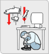
The biggest challenges of flying an airplane are attention management and responding correctly to the current situation. There's a lot going on in the cockpit: three to eight gauges, the radio, navigation, not to mention keeping the wings level and avoiding hitting the ground. And when something gets complicated you don't have a lot of time to think. So a lot of the seventy or so hours of training for a PPL is practicing things over and over until proper procedure is ingrained. The training sounds boring, but a good instructor is always pushing you just beyond what you can comfortably handle. I was a great student in school. But entirely because I would out-think the problems, I was terrible at memorization or practice. I remember getting in trouble in 3rd grade because I couldn't pass my multiplication tests fast enough. See, I didn't bother memorizing the times tables for 8 because I knew you could just multiply by four and then double it. That's the kind of student I am, and it's not what you need to be to learn to fly. There's definitely some thinking learning to being a pilot, particularly when it comes to navigation or understanding why you do stuff. But there's way more practice, and memorization, and developing the right instincts. It's a challenge for me, I'm liking it. PS: after my last aviation post a couple of people were kind enough to say they'd like to read more about flying. So I plan to write some, but not the blog-post-per-lesson I obsessively was considering.
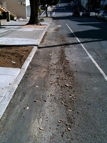
SF used to clean the streets once a week, but recently shifted to
twice a month ("second and fourth Friday"). I suspect this new
schedule has resulted in more tickets being issued, since it's
harder to remember. I could put up with our tickets (it is my fault,
afterall) if they actually cleaned the damn street. Instead they just
push all the dirt to the middle of the parking lane.
I'm learning to fly airplanes. Weather is important.
Pilots get weather reports as
METARs and
TAFs.
Which are inscrutible at first blush, but
remarkably concise and efficient once you
learn it.
You can get a sense for how inscrutible the language is when you learn that METAR officially stands for "aviation routine weather report". The actual reports are no better. KSQL 081950Z 35006KT 20SM SCT100 16/05 A3008
That wodge of text is current weather at four airports in the Bay
Area. The first line is San Carlos, where the wind is
from the north at 6 knots, visibility is 20 miles, cloud cover is
scattered at 10,000 feet, and it's 16°C (dewpoint 5°C).
That report is pretty
simple; it gets more complex when you have codes for
thunderstorms, fog, volcanic ash, etc. Charmingly some of the
codes are English (TS: thunderstorm) and some are French (GR:
grêle, hail).
KPAO 081947Z 34010KT 30SM SCT150 A3007 KHAF 081955Z AUTO 32007KT 5SM HZ CLR 17/07 A3006 KSFO 081956Z 04004KT 10SM FEW100 SCT180 17/08 A3007 RMK AO2 SLP182 T01670083 On first and second exposure I was horrified at this coding. It felt like a 1940s telegram. But having spent a couple of hours studying it I can appreciate its brevity. One particularly nice feature is that it's (more or less) fixed width, so you can quickly vertically compare reports over time or from multiple airports. They're also ideally suited for Twitter: @KSQL, @KPAO. The METAR websites offer a "translated view", with the data all unpacked into multi-line English. I see now why the pilots I know don't use it; too wordy, and you know the compact format already why not use it? I still think you could make a better reporting system using simple HTML tables, but aviation is conservative. mobilemetar.com strikes a nice balance for iPhone users. I'm toying with writing blog entries about the pilot learning process, maybe even a separate pilot blog. Or maybe just mix them in here. Have an opinion? Mail me. |
|
