
| ||

Mon 2026-04-20
Sun 2026-04-19
Sat 2026-04-18
Fri 2026-04-17
Thu 2026-04-16
Wed 2026-04-15
Tue 2026-04-14
Mon 2026-04-13
Fri 2026-04-10
Wed 2026-04-08
Tue 2026-04-07
Search
Archives
2024
12 11 10 09 08 07 06 05 04 03 02 01
2023
2022
2021
2020
2019
2018
2017
2016
2015
2014
2013
2012
2011
2010
2009
2008
2007
2006
2005
2004
2003
One good site
MDN
Nelson Minar
Blog licensed under a Creative Commons License
|
 A few years back I mentioned Bitstream Vera Sans
Mono, an excellent free monospace TrueType font. I install it on
every computer I use for coding, terminals, etc. The whole font family
is pretty useful, actually. The serif's a bit ugly but the sans is
pleasant and it's great to have a free well hinted
font.
A few years back I mentioned Bitstream Vera Sans
Mono, an excellent free monospace TrueType font. I install it on
every computer I use for coding, terminals, etc. The whole font family
is pretty useful, actually. The serif's a bit ugly but the sans is
pleasant and it's great to have a free well hinted
font.
But Vera development stopped at 1.10 and there's only spotty coverage outside of basic Western European scripts. So I was excited today to find the DejaVu fonts, an extension of Vera with more languages. I just installed it and am glad to see modern Greek, better Georgian, Lao, Thai, and Cyrillic render in PuTTY. There's font support for Arabic and Hebrew too, but PuTTY wasn't happy going right to left. And there's even some math symbols and IPA! Here's a test page with lots of screenshots.
I love infographics, and election time is a bonanza.
So much power is what you choose to highlight in the image.
BoingBoing has a
post about an alternative view of the election returns,
emphasizing the closeness of the election. The design and image are by
Jeff
Culver.
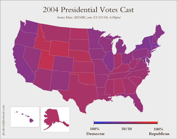
See also this county by
county map of the election results, again with the purple
colouring that emphasizes how close the vote is.
The blog world today is
full
of
links
to
Edward Tufte's sparklines,
a design element to display time series data in text. Read
the
article, it's interesting.
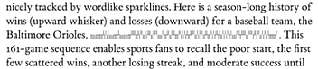 I occasionally worship at the Church of Tufte and have taken a lot of inspiration from his emphasis on simple and clean design. But many of his ideas seem awfully hard to apply well. A particular frustration is that many of Tufte's design elements rely heavily on 1200dpi multi-colour printing on fine paper. That's great, but these days all of my design is for 100dpi computer screens. Tufte has written amazing and comprehensible books that have had a good influence on everyday design. But often when people cite Tufte it's just "oooh, pretty" without really thinking about where the ideas are applicable.  Color scheme
is a beautiful colour picker. Match a base colour to others with
five different colour match types
(contrast, analogous colours, ...). View your scheme in a
simulation of various forms of colourblindness. Even has the 'web
safe' palette of yore.
Color scheme
is a beautiful colour picker. Match a base colour to others with
five different colour match types
(contrast, analogous colours, ...). View your scheme in a
simulation of various forms of colourblindness. Even has the 'web
safe' palette of yore.
The tool design is great, very simple and clean (other than the color swatch display; more functional than æsthetic). I love the implementation: a single 'live' web page running a bunch of complex javascript. As seen on
clagnut via
diveintomark
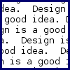
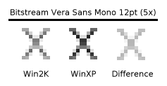
As much as I
like
Bitstream Vera, the font has a problem: it's too light on
Windows 2000. Text in 12 point Vera Sans
Mono is a vast grey field rather than crisp black text.
 The Gnome Foundation helped make something that isn't ugly; the
Bitstream Vera fonts.
Well hinted TrueType that
looks good when rendered on-screen,
free! Western languages only.
The Gnome Foundation helped make something that isn't ugly; the
Bitstream Vera fonts.
Well hinted TrueType that
looks good when rendered on-screen,
free! Western languages only.
Vera Sans Mono fills the need for a good fixed width sans-serif font; Lucida Console just doesn't cut it. Vera Sans is a decent proportional font but is too wide; I still prefer Arial. Vera Serif looks hideous, but then all serifed fonts look hideous on screen. Works on Windows. Download, SlashDot discussion.
For all your long-line typsetting needs there's U+200B, the
Unicode "Zero Width Space". It tells the renderer that if it needs to
put in a line break here's a good place to do it.
Great for when you have a really long line with no
spaces in it and don't want to just hack in a <br>.
Only it doesn't work so well in HTML. HTML 4.0's entities don't define &zwsp;. IE recognizes it but Mozilla doesn't. So you need to use ​ instead. And then IE screws it up when you paste it into ASCII. And while IE6 on WinXP renders it correctly, on Win2K it renders a box. Totally broken. There's a good page on line breaking in the Web, detailing all the problems where lines are broken where they shouldn't be and vice-versa. What kills me is these typsetting algorithms were all solved almost twenty years in TeX, at least for English. Why do the people who do HTML and web browsers hate design so much?
I saw a demo about a year ago, probably linked to from a blog
somewhere, of a color picker. It wasn't the usual design nightmare
color picker - it was a simple site where you gave it a color, clicked
"generate", and it would randomly pick several other harmonious colors
and show you what a site with that theme would look like.
I need that tool now. Do you know what I'm talking about? I've tried searching Google but am overwhelmed with crap and I can't find it on Memepool or Metafilter.
Update: Many thanks to Chris Pirillo for emailing me
what I was looking for within 45 minutes. The site
is ColorMatch 5k, as seen
on Chris' LockerGnome.
Unfortunately ColorMatch 5k is down right now, but
ColorMatch 10k
does just as well (in twice the space :-). Or this
Flash version.
Todd recommends Color Harmonies.
 I missed something on MyFont
the first time:
their WhatTheFont?!
service. You upload an image of some text, help the software pick out
individual letters, and then some magic happens and it comes up with a
list of matching fonts.
I missed something on MyFont
the first time:
their WhatTheFont?!
service. You upload an image of some text, help the software pick out
individual letters, and then some magic happens and it comes up with a
list of matching fonts.
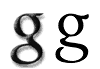
Pretty useful but not exact. For instance it can't quite match the Google logo font. The closest match Diaconia is handsome but not quite right - the Google logo font has an odd lowercase 'g' with the connector on the right, not the left. Serifs are off too. Still, WhatTheFont?! is useful for the "find me fonts that look like this" problem. MyFonts credits the University of Birmingham for development of WhatTheFont?!. They also point to Identifont as another font finding tool. Identifont looks like an expert system: answer a bunch of questions and it comes up with candidates.  I went looking for a font for a project I wanted to do and was happy
to find myfonts.com, a great
online font store.
They have a big collection
of fonts from good foundries and an easy-to-use interface for browsing
and buying.
I went looking for a font for a project I wanted to do and was happy
to find myfonts.com, a great
online font store.
They have a big collection
of fonts from good foundries and an easy-to-use interface for browsing
and buying.
The central problem in font selection is "I need a font that looks like this". myfonts.com tries to help with that - fonts grouped by category, a "fonts like this" button, and even the ability to browse other user's albums of selected fonts. Alas none of it quite works. But if you stumble around you can often find what you need anyway. |
|
