
| ||

Tue 2026-06-16
Mon 2026-06-15
Sun 2026-06-14
Queer Fascism and the End of Gay History Sat 2026-06-13
Fri 2026-06-12
Thu 2026-06-11
Wed 2026-06-10
Mon 2026-06-08
Search
Archives
2024
12 11 10 09 08 07 06 05 04 03 02 01
2023
2022
2021
2020
2019
2018
2017
2016
2015
2014
2013
2012
2011
2010
2009
2008
2007
2006
2005
2004
2003
One good site
MDN
Nelson Minar
Blog licensed under a Creative Commons License
|
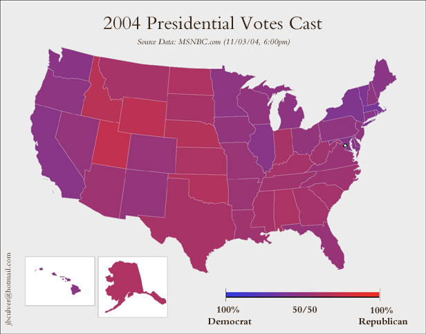
I love infographics, and election time is a bonanza.
So much power is what you choose to highlight in the image.
BoingBoing has a
post about an alternative view of the election returns,
emphasizing the closeness of the election. The design and image are by
Jeff
Culver.
See also this county by
county map of the election results, again with the purple
colouring that emphasizes how close the vote is.
|
|
