
| ||

Tue 2026-06-16
Mon 2026-06-15
Sun 2026-06-14
Queer Fascism and the End of Gay History Sat 2026-06-13
Fri 2026-06-12
Thu 2026-06-11
Wed 2026-06-10
Mon 2026-06-08
Search
Archives
2024
12 11 10 09 08 07 06 05 04 03 02 01
2023
2022
2021
2020
2019
2018
2017
2016
2015
2014
2013
2012
2011
2010
2009
2008
2007
2006
2005
2004
2003
One good site
MDN
Nelson Minar
Blog licensed under a Creative Commons License
|
I hate the coverage of the Super Tuesday results. We get stupid orange/purple
maps showing who won the majority, completely obscuring the size of
the majority, the number of delegates, or the number of people who
voted. Inspired by Robert
Venderbei's red/blue maps I tried to do a better choropleth map.
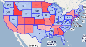 This visualization is not very useful, honestly, I don't like the constraints of the map drawing tool I'm using. Can anyone suggest better simple software for drawing coloured US states? Then again geography may not be the right foil; delegates or popular vote is more important than location. I didn't triple-check that the data is accurate. Sources:
|
|
