
| ||

Tue 2026-06-16
Mon 2026-06-15
Sun 2026-06-14
Queer Fascism and the End of Gay History Sat 2026-06-13
Fri 2026-06-12
Thu 2026-06-11
Wed 2026-06-10
Mon 2026-06-08
Search
Archives
2024
12 11 10 09 08 07 06 05 04 03 02 01
2023
2022
2021
2020
2019
2018
2017
2016
2015
2014
2013
2012
2011
2010
2009
2008
2007
2006
2005
2004
2003
One good site
MDN
Nelson Minar
Blog licensed under a Creative Commons License
|
A lot of aviation charts are
visually complex, presenting a real readability problem. But one kind of chart has fantastic graphic design: the Airport Diagram. Clean and spare,
fine black and white, very easy to read. You really need to
view the PDF to get the full effect, they're intended to be printed 5"x8".
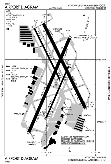 Aren't they beautiful? Such spare lines, just one shade of grey, and a clean all caps font that is clear and authoritative. These diagrams are provided at no cost by NACO, part of the FAA. They also produce the beautiful instrument approach diagrams which are a similarly elegant example of lots of data packed legibly in a small piece of paper. |
|
