
| ||
Tue 2026-06-02
Mon 2026-06-01
Sun 2026-05-31
Guidelines for Respectful Use of AI Sat 2026-05-30
Fri 2026-05-29
Thu 2026-05-28
Wed 2026-05-27
Tue 2026-05-26
Mon 2026-05-25
Sun 2026-05-24
Sat 2026-05-23
Fri 2026-05-22
Search
Archives
2024
12 11 10 09 08 07 06 05 04 03 02 01
2023
2022
2021
2020
2019
2018
2017
2016
2015
2014
2013
2012
2011
2010
2009
2008
2007
2006
2005
2004
2003
One good site
MDN
Nelson Minar
Blog licensed under a Creative Commons License
|
It's amazing that a whole country could have a vernacular of bad web
sites, but I think France has managed it. Hotels and restaurants
regularly have terrible sites that give the user "an experience",
complete with Flash and music and precious little useful information.
For a typical example, see the text-free site of the luxury restaurant
La Tour d'Argent. Or try
to "enter" the site for the Petite Nice Passedat.
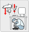
To be fair, a lot of American hotel sites have stupid "experiences" too. But in France even the informational sites are lousy. For example, Mappy, the main French map site (now obsolete, thanks to Google). Marvel at that front page, with 16 separate text entry areas. But the king of awful websites is the SNCF, the online train booking. The have a site in English, which is awfully nice, only about a third of the links don't work and give you French error messages. Here's how to book a train:
I'm sure there are some wonderful French web sites out there, and I personally know some great French web designers. But the examples I keep finding are just awful. |
|
