
| ||

Mon 2025-06-30
Sat 2025-06-28
Fri 2025-06-27
Wed 2025-06-25
Tue 2025-06-24
Mon 2025-06-23
Sat 2025-06-21
Thu 2025-06-19
Wed 2025-06-18
Mon 2025-06-16
Fri 2025-06-13
Search
Archives
2024
12 11 10 09 08 07 06 05 04 03 02 01
2023
2022
2021
2020
2019
2018
2017
2016
2015
2014
2013
2012
2011
2010
2009
2008
2007
2006
2005
2004
2003
One good site
MDN
Nelson Minar
Blog licensed under a Creative Commons License
|
One of the fun things about pilot training is learning to do things the old way. I've just learned the art of plotting courses using an E6B, a glorified slide rule. Initially I mocked this old tech, but having learnt it I admire how simple and unmediated it is. And I can do all my calculations on a 65 year old whiz-wheel, my father's Army Air Force issue Computer: Dead Reckoning.
 The other side of the E6B is a simple circular slide rule for doing multiplication and division. It has scales for fuel consumption, distance and rate calculations, converting °F to °C, etc. Initially I used my iPhone for this arithmetic but I kind of prefer rotating the wheels and reading the numbers off the scale. The imprecision of a slide rule reinforces that everything is just an estimate. And I'm constantly sanity checking everything to make sure I'm didn't misread a scale by a factor of 10. That extra work seems to help reinforce the course planning. I'm pretty sure as soon as I pass my pilot exam I'll never use an E6B again. It's much easier to use map-based flight planning software, or for that matter just to jump in the plane and let the GPS computer figure it out for you. More accurate, too. But the old way's kind of cool.
Video totally worth watching, the Vice Guide to Liberia. A travel documentary looking at Liberia and its recovery from brutal civil war. Parts 1-6 are online now, rest to come. The trailer gives you an idea what to expect. Vice is obnoxiously hipster, but you have to respect they actually produced this video. Not something you're likely to see Anderson Cooper do.

A lot of aviation charts are
visually complex, presenting a real readability problem. But one kind of chart has fantastic graphic design: the Airport Diagram. Clean and spare,
fine black and white, very easy to read. You really need to
view the PDF to get the full effect, they're intended to be printed 5"x8".
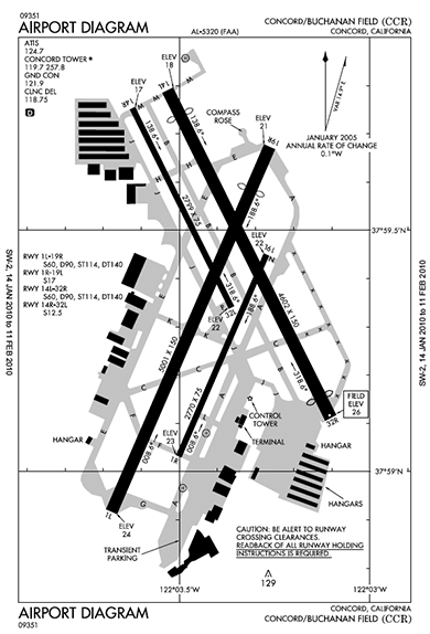 Aren't they beautiful? Such spare lines, just one shade of grey, and a clean all caps font that is clear and authoritative. These diagrams are provided at no cost by NACO, part of the FAA. They also produce the beautiful instrument approach diagrams which are a similarly elegant example of lots of data packed legibly in a small piece of paper.
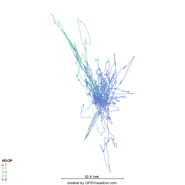
My last blog post talked about how GPS altitude works in theory. Now then, how does it work in practice?
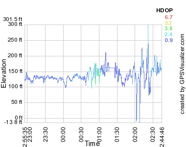 For my recreational purposes that large error is acceptable, and in flight the tracks are better than the above would suggest. For instrument navigation pilots use something like the GNS 430W, which for $8000 is accurate to within 6 feet and is certified to let you fly approaches as low as 250 feet above an airport you can't see in the fog. You can get even more accurate with a radar altimeter: $10,000 gets you your altitude over the actual ground below you to within 3 feet. Ironically, pilots seldom use anything other than pressure altitude for actual navigation altitude. A barometer in a steam gauge may not be terribly accurate, but it's not bad when calibrated and close to the ground. Also it's important all planes up in the air have the same kind of error, so we all use the old tech. Most GPS users don't care about GPS altitude either. Most people are on the ground, jogging or biking or driving, and there you're much better off using a database to know your current height. GPS altitude is useful for me in my flight tracking, just to see if I flew where I was supposed to. Even there it's annoying because sometimes the error puts me below the runway and Google Earth doesn't render that very well. One last caveat about GPS altitude and GPS in general. If you really care about your position you also care about RAIM. Sometimes GPS satellites fail or are in an inconvenient place. It's mostly predictable, you can look at a RAIM prediction map that shows a pessimistic view of GPS service. A high end GPS receiver with RAIM will constantly do crosschecks on the measured position and alert you when the position data is not high quality. (Parenthetically, I love my inaccurate AMOD data logger. It's very easy to use and at $65 is just fine for my recreational purposes. It's based on the well-regarded SiRFstar III chipset and even does WAAS to correct for ionospheric errors. Part of why my experimental error was so large may have been because I have static navigation turned on: when stationary, it may be better to turn it off.)
GPS is one of the wonders of the modern age (RIP, LORAN). But while GPS is
great for showing your position, it's
not so good at showing altitude. Part of the problem is the satellite geometry makes for poor triangulation of elevation. But worse, elevation itself is difficult to define.
If you're flying a plane, what you care about is how far you are above the ground (AGL). GPS won't tell you that since it doesn't know where the hills are. But GPS can tell you your altitude above sea level (MSL), which you can then compare to a map which shows terrain in terms of MSL. But where is sea level? Annoyingly, that's locally defined. Naively you'd just measure your distance from the center of the earth. Which is more or less what GPS does in that positions are defined relative to WGS84. The earth's not quite a sphere, so WGS84 is actually a pole-flattened spheroid, the polar distance is 0.335% shorter than the equatorial. GPS calculates your altitude above that spheroid. But the earth isn't a uniform object, it's lumpy. I don't mean the mountains, but rather the varying density inside the earth causes ripples in the gravimetric field. If you could conceptually flood the earth with enough water to cover all the mountains, the resulting global sea would not be flat.  One last bit of detail: how do we know where the GPS satellites are? Their position is measured and updated regularly from ground stations. But everything in the universe is moving, so what do you measure position relative to? Answer: quasars. Astronomers define the International Celestial Reference Frame relative to the position of 212 quasars. Those quasars are themselves moving, but they're so far away that their apparent motion to us on earth is near zero and so we pretend they're fixed landmarks to reckon against. I love how GPS combines deep space astronomy, orbital mechanics, gravimetry, geology, and good old fashioned geography and survey work to tell us where we are with some accuracy. And don't forget special and general relativity, too!  It took four months, but I finished reading Gary Taubes' masterwork of science journalism,
Good Calories, Bad Calories. If what he writes is correct, this could be the most important popular health and diet book written in a very long time.
It took four months, but I finished reading Gary Taubes' masterwork of science journalism,
Good Calories, Bad Calories. If what he writes is correct, this could be the most important popular health and diet book written in a very long time.
The first half of the book is a long and careful investigation into the science behind diet and the "diseases of civilization": obesity, type-2 diabetes, heart disease, cancer. The conclusion is grim: all our common wisdom is poorly founded. "Everyone knows" that people get fat from eating too much and not exercising enough, that eating fat makes you fatter, and that eating cholesterol causes blocked arteries. But those statements are all scientific hypotheses, not axioms, and it turns out the experimental science doesn't confirm them. Taubes looks in detail at the science and politics behind current government recommendations: low fat diets, exercise and calorie restriction for weight management, etc. And frequently finds problems with the science like inconvenient data ignored, alternative studies dismissed, and personal bias overcoming good science. He also dives deep into the politics. One of the most shocking things is the way public health officials have basically run a giant nutrition experiment, advising Americans to eat low fat diets with no solid evidence that's actually healthier. The last part of the book examines an alternate dietary hypothesis: that carbohydrates are the source of our health problems, not fats. There's research that indicates that the insulin response from eating refined carbohydrates causes your body to store that sugar in fat cells rather than using it as energy, leaving you still hungry but fatter. This metabolic response seems like it could be very interesting for understanding both obesity and type-2 diabetes. If Taubes' book encourages more research in that area, it's a success. The best thing about Good Calories, Bad Calories, and also the most demanding, is how thorough the journalism is. This isn't some hot screed selling a fad diet, it's a boring, meticulously footnoted examination of the actual original science journal articles that led us to our current dietary understanding. It makes for slow reading and a frustratingly muddy final story. But it also feels true, much truer than the platitudes, moralism, and oversimplification that is the usual diet discourse. Definitely worth reading if you are interested in diet and metabolism, or just interested in a detailed story about public policy and science. See also his (much shorter) 2002 NYT article What if It's All Been a Big Fat Lie, this somewhat negative review of the book, and this positive review. Update: it's going against the spirit of
the book to synopsize it like this, but here's the
author's
summary of his conclusions in a short 10 item list.
I had my first solo flight yesterday! After about 25
hours of flying lessons my instructor asked me if I felt ready. I did,
so he hopped out of the plane and I took my first flight by myself.
Three quick trips around the pattern later and I've got my first half
hour as pilot in command. I'm very proud.
 Fortunately I was well prepared and the solo flights weren't really any different from the ones with my instructor. The engine coughed once on my first takeoff, that gave me a momentary scare. And I was so excited that I got a bit jumpy on the microphone switch and kept cutting out on the poor controller. But that's just nerves, nothing another 40 hours of lessons won't cure. My landings were actually pretty good, even if the radio work wasn't. Here's a Google Earth file if you want to see in detail. I sort of feel like I already know everything about flying planes VFR and just need some practice. Of course, that's not really true. I definitely need practice. Also still a lot to learn: cross-country planning, navigation, night flying, short field procedures, etc. And part of what's fun about flying is you can always get better at it. But I've passed the first big test!  I'm fascinated by pre-Columbian American history. A whole alternate human history, right here where we live now, different writing and math and technology. And so little known about it! Science journalist Charles Mann's book
1491 scratched my itch to learn more about New World civilizations. It's intelligent but not too demanding, anthropology-lite in the vein of Guns, Germs, and Steel if not as ambitious.
I'm fascinated by pre-Columbian American history. A whole alternate human history, right here where we live now, different writing and math and technology. And so little known about it! Science journalist Charles Mann's book
1491 scratched my itch to learn more about New World civilizations. It's intelligent but not too demanding, anthropology-lite in the vein of Guns, Germs, and Steel if not as ambitious.
Mann's book is written to demonstrate his thesis that New World civilizations were way more developed and technological than our common understanding. He neatly dismantles the idea that Indians were a sparsely populated low impact culture living in harmony with Mother Earth, dismissing it as both racist and not supported by science. Instead in the eleven chapters he presents detailed archaeological research about the surprisingly technological Indian civilizations. Some of the ground he covers includes the continuing controversy over the initial migration dates, the astonishingly urban complex of Norte Chico in 3200 BC and its uniquely specialized economy, and an emerging case that the Amazon rainforest is not some wild pristine environment but instead the result of centuries of deliberate gardening by its inhabitants. The tour of archeology is fun but even better is Mann's explanation about how all of this history is surprising us just now. A big part of our misconception about native peoples' lives is that by the time Europeans met them, 90-98% of them may have died from disease. I'd understood before how smallpox, etc helped the Europeans conquer the New World but I never quite connected our romantic idea of sparse Indian settlements to the fact that, duh, almost all of the people living in the Americas died 1492-1550. He also talks in some detail about the relative lack of physical artifacts from cultures that tended to build with soft, perishable materials. And of course there's also the willful, deliberate destruction of all written records by evil Catholic bishops and the like. If I have a complaint about 1491, it's that when I finished reading it I have an even less clear picture of pre-Columbian history than I did before reading it. The simple schoolboy story is a simple narrative. Now that I've learned more specifics about particular examples the big picture has gone fuzzy. Which may very well be fair and accurate now, given how little we know. |
|
