
| ||

Fri 2026-05-15
Thu 2026-05-14
Tue 2026-05-12
Sun 2026-05-10
Fri 2026-05-08
Kyle Kingsbury Podcast Podcast Mon 2026-05-04
Sun 2026-05-03
Fri 2026-05-01
Thu 2026-04-30
Wed 2026-04-29
Tue 2026-04-28
Search
Archives
2024
12 11 10 09 08 07 06 05 04 03 02 01
2023
2022
2021
2020
2019
2018
2017
2016
2015
2014
2013
2012
2011
2010
2009
2008
2007
2006
2005
2004
2003
One good site
MDN
Nelson Minar
Blog licensed under a Creative Commons License
|
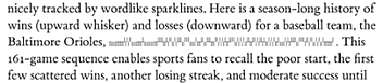
The blog world today is
full
of
links
to
Edward Tufte's sparklines,
a design element to display time series data in text. Read
the
article, it's interesting.
 I occasionally worship at the Church of Tufte and have taken a lot of inspiration from his emphasis on simple and clean design. But many of his ideas seem awfully hard to apply well. A particular frustration is that many of Tufte's design elements rely heavily on 1200dpi multi-colour printing on fine paper. That's great, but these days all of my design is for 100dpi computer screens. Tufte has written amazing and comprehensible books that have had a good influence on everyday design. But often when people cite Tufte it's just "oooh, pretty" without really thinking about where the ideas are applicable. |
|
